Never has the adage “A Picture Paints a Thousand Words” been truer when it comes to seeing data—with “seeing” being the key word. How you choose to see data has a major impact on how well you can comprehend the data and leverage it to make business decisions.
You can throw a bunch of numbers at managers in spreadsheets or dashboards; but they might not understand exactly what the numbers mean to the business. Best-case scenario: it takes hours to decipher the information. Worst case: they never get there.
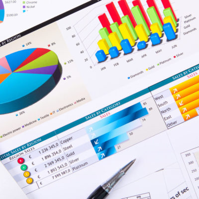
Now make that same information graphical—in the form of pie charts, line and bar charts, heat maps, box-whisker plots, scatter plots, radial charts, Sankey diagrams, and many others. Suddenly, the same information comes through loud and clear, and much more quickly. The number of sales closed by individual reps presented as numbers in a column just doesn’t have the same impact as colorful graphics:
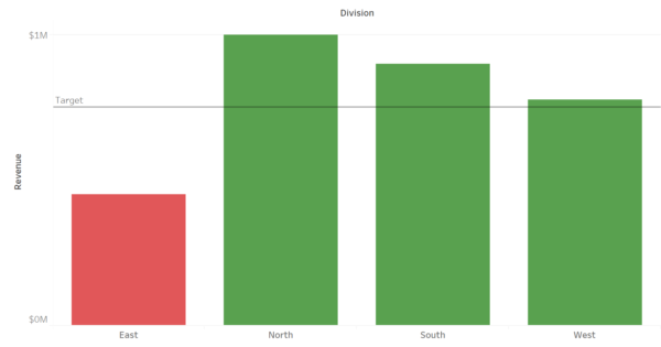
In this case, it’s painfully clear “Red” has some catching up to do!
Graphics tend to communicate information more clearly because not everyone is a numbers person or wants to see data on a tabular report. Some people even break out in hives when they see an Excel spreadsheet!
But give them a picture or a ticker chart, and the key information can be easily translated and understood. Visualization gives many people a quicker way to process information compared to reading numbers and trying to interpret how they relate to each other. With data visualization, it’s usually much easier to spot trends and outliers and to predict future outcomes.
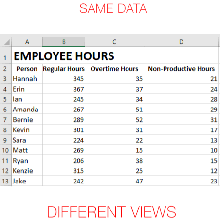
For example, imagine seeing a table that lists key accounts by city and state. Then see a picture of the same data on a map, which could show factors such as clustering and geographic proximity. From there you could use coloring to add another dimension to the same data or size to show magnitude.
Using this alternate view of the same data, management might be able to uncover information on why sales teams are so successful because they can identify a particular region where the map shows clusters of clients. Management might also realize why service costs are so high in another region—where client locations are spread out.
Leading visualization tools, like Tableau and PowerBI, can present the same data in multiple formats. A bar graph may resonate best for one individual while the same data presented in a pie chart will hit home more strongly for another individual. More advanced users may be looking for statistical analysis showing trends and forecasts or the ability to dynamically interact with this data.
Two views of the same data could also help one individual discover or better understand two pieces of information. As each individual chooses the degree of visualization they are comfortable with, they can add depth and context to the data to develop a deeper understanding.
A visualization solution makes it possible to instantly change the data being analyzed or to change the way you are looking at a specific data set. The combination of these two capabilities is important because different questions require different data sets, and different views of the data can provide the answers to those questions.
Visualizations also allow users to drill down and filter the results. Perhaps a user first identifies a trend, and then drills down into the spreadsheet behind the visualization to delve into the specific numbers. In this sense, you can still cater to those who prefer to work with numbers in Excel!
Spreadsheets presenting data from multiple sources may not be useful and may not give your management team what they need to drive your business. What’s worse, they may spend hours spinning their wheels in search of the vital data they require.
But data presented in graphical form can literally be exhilarating. Within minutes, managers truly “see” the information they need in order to understand what the data is communicating. As a result, decisions occur sooner—so your business can more quickly seize upon opportunities to generate more revenue, improve process efficiencies, and create new ideas on how to run the business.
Gaining the ability to see data through visualization also helps managers identify the root cause of issues as they go beyond spreadsheets and dashboards with their limited pre-set filters and categories. Viewing data through various visualizations spawns innovation and leads to new thoughts that enable managers to look at challenges in a whole different light.
That’s because visualization is a dynamic, iterative process—where managers quickly build different views to explore infinite paths and discover what is going on and why within the business. Visualization helps people ask new questions and find new answers that lead to unexpected discoveries. With a bigger view and improved ability to see the data, your managers get information faster in a way that makes those light bulbs turn on!