It is commonly understood that information is the currency of business. Organizations that can harness their data and make data driven decisions will be the winners in the new economy.
When it comes to accessing and understanding data, it is often times referred to as “reporting and analytics”. While they are clearly related, there is a big difference between accessing reports and using business analytics. A core difference is that reporting focuses on compiling and aggregating data into a readable format, while the purpose of analytics is to interpret data. Interpretation is not just understanding what the data says, but more importantly accessing why something happened and what may happen in the future. Being a data driven organization requires more than simply looking at static reports.
Many leading companies in the U.S. have deployed and adapted the tools and processes around business analytics and the results are very telling:
“Data Driven companies are 23x more likely to outperform competitors, 19x more likely to achieve above-average profitability. 15x more likely to deliver better value to their customers”
McKinsey Global Institute (2016). The Age of Analytics: Competing in a Data-Driven World. Retrieved from https://www.mckinsey.com/
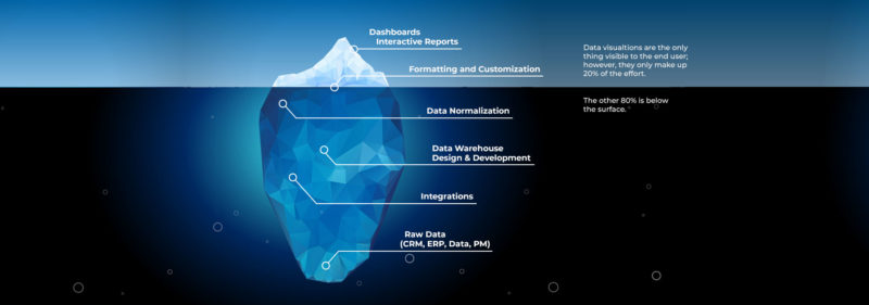
Components of Business Analytics
There are a number of components needed in order to deploy business analytics tools and become a data driven company. The image below illustrates that most of the necessary components are not visible to end users.
Raw Data Sources – it’s important that all key data sources can be accessed and viewed. Most construction companies today have three or four core applications in use. While Sage 300CRE is most likely the central application, it is necessary to bring in data from other applications such as CRM/Bid Management, Project Management, HR systems, or even MS Excel.
Integrations – it is necessary to keep the data synchronized on a standard interval, often daily or more frequently. This process involves integrating new data from source systems to the data warehouse.

Data Warehouse & Aggregation – the data that needs to be included in your organization’s view is then synchronized into a Data Warehouse. A data warehouse is a centralized database that contains copies of the raw data, which can then be aggregated into common views. This allows users to perform analysis on a fully replicated version of their data and avoid using live/production systems which can cause very slow performance for both users doing the analysis and users working in the core application.
Data Normalization – within the data warehouse, the data is most often normalized. Examples of data normalization are removing duplicate records, standardizing naming conventions, and using logic to generally “clean” the data.
Data Visualization Tools – there are a number of data visualization tools on the market, some products that you may already be aware of are: Tableau, Power BI, or QlikView. These tools allow the creation of graphical and visual dashboards, KPI’s, data trending charts, etc. These tools are very powerful as they let users “see” data in ways that are not possible in standard reporting tools. They also have many features to allow for aggregation, filtering, sorting, and drilling into details. For many users, it is an eye-opening experience to fully access their data for the first time. Data can be made more accessible by creating subscriptions that “push” dashboards out to end users, the creation of specific user views, and situational alerts. All these things help the organization make better data driven decisions.
The Business Analytics Journey
A new business analytics initiative begins with choosing the technologies and partner to sync and display your data. At ATX, we have created a Business Analytics platform and managed service called Caliper that takes the technological complexity out of building your own platform. Caliper provides a world class data visualization tool, along with pre-built integrations, common views, and data warehousing infrastructure. Additionally, there are many construction, service, and financial specific dashboards and visuals to provide an ideal and well-designed first step into harnessing your data.
After the technology is deployed and initial dashboards and visualizations are configured to work, the journey really begins. Some visualizations may not look right because key data is not being captured. Processes, data flows and integrations are modified to make the data cleaner and more useful.
After getting good quality data and potentially identifying and integrating additional core data sources, many clients start to focus on unique Key Performance Indicators (KPI’s) and creating other aggregation-type dashboards. This process takes additional design ideas from company leaders that understand what makes their business unique and what they need to “drill into” and better understand to direct the firm. An aggregation dashboard may focus on a single data element and pull in many types of data all related to the one element such as a client or project manager. A good platform will have many of these metrics available “out of the box”, but it is critical that business leaders continue to hone their data visualizations to work for them. No two companies are the same, and no two companies should be looking at the same exact dashboards.
The Future of Analytics is Now
Beyond understanding what has happened in the business, the journey leads into Predictive Analytics. The true benefit of data is not informing about what has happened, but what is going to happen. This asset enables companies to make data-driven decisions that capitalize on opportunities, minimize risk, and align resources to reduce costs. There are many examples of predictive analytics in construction firms; most common are true cost backlog burndown and revenue forecasts. With Caliper, you can predict and see when all backlog will burn (and related margin gain/fade) by time period, project type, project manager, project, cost code, category, etc. With any data dimension that is captured, you can easily see or predict when it will occur. You can even see who or what “dimension” is not providing accurate forecasts in an important feedback loop to assist in your data journey.
At ATX, we are committed to the future. With the Caliper Construction Analytics platform, we can deploy cutting edge technologies and provide the support needed to help you on your journey and realize the benefits of becoming a data driven company.
Author: Brendan Abbott
To learn more about the Caliper or anything else we offer at ATX, feel free to reach out to me at brendan.abbott@atxadvisory.com